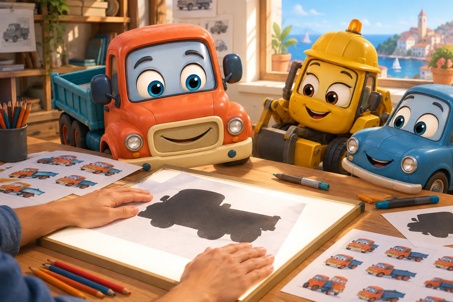
The silhouette is the first test of any animated character. If a viewer can recognize a hero from a black shape — no color, no detail, no texture — then the design works. In mobile animation, where screens are small and attention is fragmented, this test becomes not an aesthetic exercise but a commercial tool. A strong silhouette lowers the cost of brand recognition, speeds up the viewer’s reaction when a hero appears on screen, and makes a character portable — from screen to merch, from cover to ad creative, from episode to episode.
After years of producing animated content for mobile platforms, we’ve settled on a simple rule: the silhouette is tested before the color palette is approved. Not after. Not in parallel. Before. Because color can be changed in an hour, but a character’s shape can only be changed by redrawing the entire animation. And if the silhouette doesn’t work at the concept stage, it won’t magically start working at release.
What Makes a Readable Silhouette
A readable silhouette is a character outline that conveys their essence without any internal detail. Imagine filling the figure with black paint. Is it still clear who this is? A warrior with a sword, a girl with an umbrella, a robot with antennas — or just a person? If the answer is “just a person,” the silhouette isn’t working.
A good silhouette is built on three levels. The first is overall shape: head-to-body proportions, shoulder width, limb length. The second is signature elements: hairstyle, clothing, accessories that create a unique profile. The third is the default pose: how the character stands when they aren’t being animated. A standing pose is part of the design, not part of the animation. If a character stands like a mannequin, the silhouette dies — even if the shape is well-crafted.
How the Silhouette Works on a Small Screen
On a mobile screen, a character often takes up 20–30% of the frame. In horizontal video, that might be 200 pixels in height. In vertical — even less. At that scale, facial details are indistinguishable. The color palette blends into a single blob. The only thing that remains is the silhouette.
We’ve tested this on our own projects. In one animated series for mobile platforms, the main character was designed with an emphasis on facial detail — complex expressions, expressive eyes, hair texture. On high-resolution preview frames, the character looked great. But on a phone screen in on-the-go viewing, viewers didn’t recognize him in frame until the camera moved in for a close-up. An episode with a reworked silhouette — more pronounced shoulders, a different hairstyle shape, a more recognizable pose — showed an 18% increase in completion rate within the first minute. Not because the character got prettier. Because he became more recognizable at the scale where the viewer makes their decision.
Three Seconds to Recognize
A mobile viewer decides whether to watch in three seconds. In those three seconds, a character’s silhouette must do two things: grab attention and convey mood. These are not the same thing.
Grabbing attention means standing out from the surroundings. A contrasting shape that breaks the horizontal and vertical lines of the background works better than complex detailing. Conveying mood means communicating through pose and proportions what the viewer will feel. Rounded shapes read as friendly. Sharp angles read as dangerous. Elongated proportions read as dramatic. These associations work at a level that requires no translation and doesn’t depend on language.
Color Outline and Silhouette Are Different Tools
Designers often confuse silhouette with color outline — the stroke that separates a character from the background. A color outline helps in a specific frame but doesn’t solve the portability problem. A character with a good outline but a weak silhouette won’t work on merch, in ad creatives with simplified graphics, or in user avatars.
The difference becomes obvious when a character lands in an ad creative. Advertising often uses simplified versions of characters — fewer details, less color, fewer layers. If the silhouette doesn’t hold, the character turns into an unrecognizable blob. If it holds, the viewer connects the ad to the series even without a logo or caption. This is especially important for international campaigns, where a creative lives in a feed alongside dozens of other videos.
How Silhouette Impacts Merchandising and Branding
A strong silhouette is an asset that works beyond the series itself. Licensing, merchandising, partner placements — all require the character to be recognizable in simplified form. A figurine, a sticker pack, an app icon — these are all silhouette tasks.
When we plan a character for international distribution, we build in a silhouette that withstands three levels of simplification: full design, flat vector version, and single-color icon. If a character doesn’t pass the third level, we revise the design before production starts — because after release, the icon is the first thing a potential viewer sees in the app store and on platforms. According to industry reports, the media and entertainment market reached $3.12 trillion in 2026, and competitive differentiation is increasingly shifting toward software-defined production and localization. In this environment, a recognizable silhouette isn’t a luxury — it’s a baseline requirement.
Design Mistakes That Destroy the Silhouette
The most common mistake is overloading with accessories. A designer adds a scarf, a belt, a bag, headphones, and glasses because each element “tells a story.” But every element adds noise to the silhouette. A good rule: if you remove an accessory and the silhouette doesn’t change, it’s not part of the silhouette — it’s part of the texture. If the silhouette does change, you need to decide whether that enhances recognition or just adds complexity.
The second mistake is symmetry. A symmetrical silhouette looks static. Slight asymmetry — a shifted shoulder line, different arm lengths, a tilted head — creates a sense of movement even in a static pose. For mobile animation, where shots are often short, this is especially important: a character must look alive even in the first frame.
The third mistake is copying real human proportions. Realistic proportions produce a realistic silhouette, and a realistic silhouette is “just a person.” Animated proportions — an enlarged head, shortened limbs, an altered shoulder structure — create a shape that doesn’t exist in reality and therefore sticks in memory.
Silhouettes of Secondary Characters
The main character usually gets the designer’s full attention. Secondary characters are often left as an afterthought. But in mobile animation, secondary characters appear on screen just as often, and the viewer needs to tell them apart instantly.
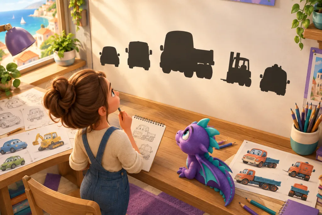
The solution is a silhouette palette for the series. Each character gets a unique silhouette formula: different proportions, different line types, different signature elements. When all characters are lined up by silhouette, none should blend into another. This rule applies to crowds too: background characters are simplified into silhouette archetypes that don’t compete with the leads. If two secondary characters have similar silhouettes, viewers confuse them, and the story loses clarity.
How the Silhouette Survives Localization
International localization changes texts, voices, and sometimes cultural details. But the silhouette is what stays unchanged across all versions. A strong silhouette works the same in Japan and in Brazil because it doesn’t depend on language. This makes the silhouette the most reliable tool for international branding of an animated series.
We’ve seen cases where a localized version of a series changed the color palette to suit regional preferences, but the silhouette stayed untouched — and character recognition didn’t suffer. The reverse is also true: a weak silhouette isn’t saved even by perfect localization, because the viewer doesn’t recognize the hero in a new color environment. When the localization budget is tight, the silhouette is the part of the design that doesn’t need a single cent invested for each new market. It already works.
Silhouette Testing During Production
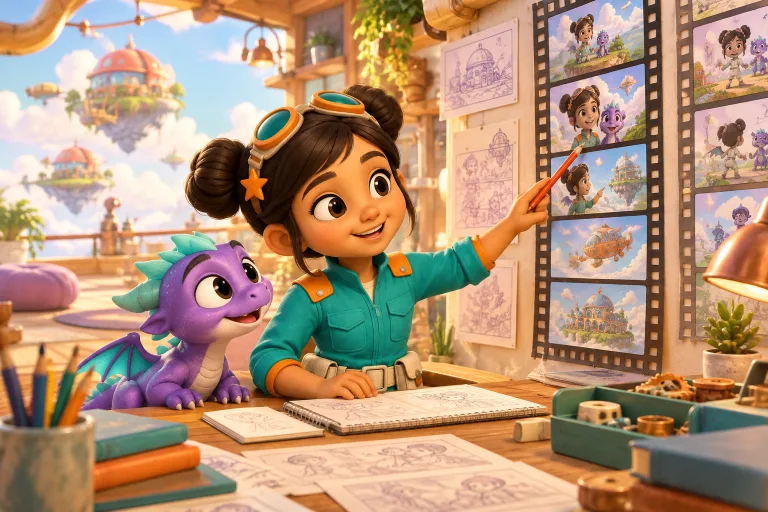
Silhouette testing isn’t a separate stage — it’s a built-in part of the process. We recommend three checkpoints. The first is at the concept art stage, before color approval. The second is at the storyboard stage, when the character first appears on screen. The third is at the ad creative stage, when the character is simplified for a banner or icon. If the silhouette doesn’t work at any of these points, we go back to the shape — not to color or detail.
Studios that produce animation in runs of three seasons a year, as described in the guidelines of a major Japanese studio, use AI to automate repetitive mechanical tasks but leave creative work — including character design — to humans. The silhouette in this context is precisely the kind of creative decision that can’t be delegated to automation. It determines whether a character will be recognizable across three episodes, three markets, and three years.
Checklist: Testing a Character’s Silhouette
- Fill the character with solid black and check whether they remain recognizable without details
- Line up all the series’ characters by silhouette — none should blend into another
- Shrink the silhouette to app-icon size — the character’s essence should survive
- Check whether the default pose conveys the character’s mood without animation
- Remove accessories one by one — if the silhouette doesn’t change, they aren’t part of the design
- Compare the silhouette against background elements — the character should stand out by shape, not just by color
FAQ
Do I need to test the silhouette for every secondary character?
Yes, if the character appears on screen more than once. Background characters can be simplified into silhouette archetypes, but recurring secondary characters should have unique silhouettes that differ from both the leads and each other.
What if the silhouette doesn’t work but the design is already approved?
The minimal fix is proportions and default pose. Shift the shoulder line, change the head tilt, remove one accessory. These edits don’t require redrawing the entire animation, but they noticeably improve recognition.
How do I test a silhouette without a full render?
Fill the silhouette layer with black at the storyboard or concept art stage. It takes a minute and doesn’t require finished animation. It’s best done before the color palette is approved.
Does the silhouette work in vertical format the same way as in horizontal?
The principle is the same, but the composition differs. In vertical format, a character often takes up more of the frame’s height, so the silhouette reads better. However, the overall shape should be designed with both formats in mind if the series ships on multiple platforms.