Color isn’t just a finishing touch added to an animation at the final stage. On a mobile screen, color works as a retention tool from the very first second: it guides the eye, sets the mood, and helps the viewer instantly understand what’s happening. When a palette is built consciously, the viewer doesn’t think about it—they just keep watching. When the palette is random, attention starts to dissipate by the tenth second, and this is visible in completion rate data.
In mobile animation, you have less screen space than in TV or cinematic productions. A character figure might take up a third of the frame, leaving the background to fill the remaining two-thirds. If the background and character blend in tone, the viewer spends extra time searching for the focus. This isn’t a matter of aesthetics—it’s a matter of perception speed. On a small screen, the viewer won’t give you two seconds to figure it out. They either lock their eyes on it, or they scroll past.
Why Color Matters More Than You Think
In TV animation, the viewer is in a passive position: they sat on the couch, turned on an episode, and are ready to watch. In a mobile environment, the viewer is active. They’re holding the phone, notifications are flashing nearby, and music might be playing in their headphones. Attention is fragmented. Under these conditions, color takes on the work that slow exposition and dialogue do in longer formats.
A well-constructed palette does three things at once. It grabs attention in the first few seconds through contrast. It holds attention through the rhythm of color accents within a scene. And it creates recognizability—the viewer starts associating certain combinations with your series, even if they can’t explain why. This recognizability works as a visual brand: when the next episode pops up in the feed, the color cues the brain that this is familiar content.
Contrast as the Main Focus Tool
On a small screen, contrast between the character and the background is more important than detail. A character drawn with lots of textures and small elements gets lost if their tone is too close to the background. As a result, the viewer sees a “mess” and doesn’t know where to look. A simple rule: the main object of the scene must differ from the background in at least one of three parameters—lightness, saturation, or hue.
In practice, this means if the background is dark and muted, the character should be light and saturated. If the background is bright and busy, the character should stand out through a darker or purer tone. This doesn’t mean every frame should be maximally contrasted—on the contrary, moderate but consistent contrast works better than sharp jumps. Viewers get tired of constant visual aggression just as much as they do from monotony.
Saturation and Viewer Fatigue
One common mistake in mobile animation is maxing out the saturation of the entire frame. Creators fear that color will “get lost” on a small screen and crank up the saturation on all objects. The result is the opposite: the frame becomes visually noisy, the eye finds no anchor, and after 15–20 seconds, the viewer loses interest.
A more effective approach is to manage saturation as a dramatic tool. Key moments in a scene get more saturated colors, while transitional and background elements are muted. This creates a visual rhythm: the viewer’s eye rests in calm moments and activates in key ones. This rhythm sustains attention naturally, without the need to constantly speed up the editing pace.
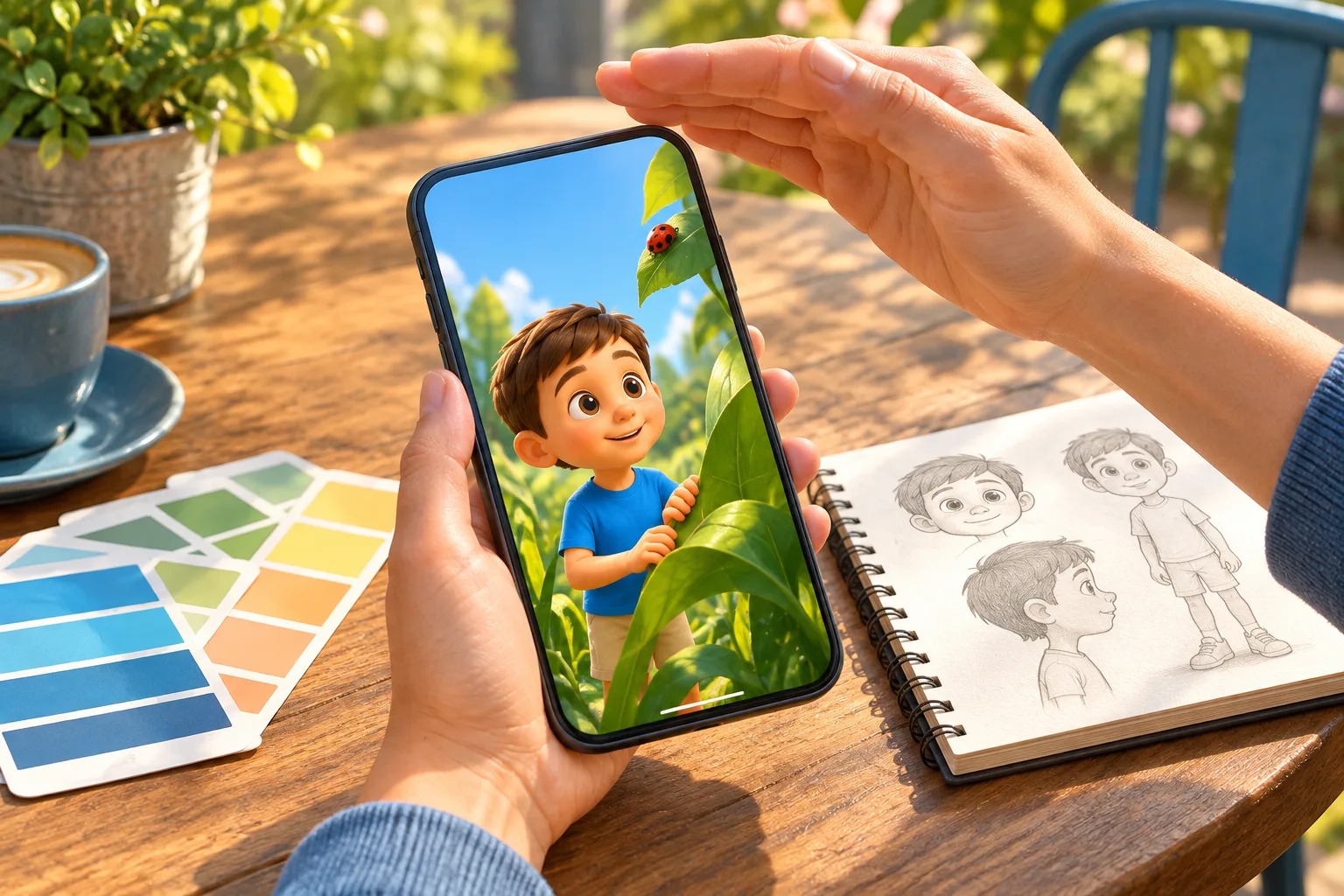
Background Palette and Scene Atmosphere
The background in mobile animation isn’t just decoration. It sets the emotional tone of the scene and provides context for the action. If the background is neutral and monotonous across all episodes, the series quickly loses its visual identity. If the background is too detailed and busy, it competes with the character for attention.
A working approach is a limited background palette that shifts depending on the scene’s emotional state. Calm scenes get cool, muted tones. Conflict-heavy or emotionally intense scenes get warm and more contrasting tones. This doesn’t require complex work: even a shift from blue-gray to a warm yellow-orange makes a noticeable difference in perception.
It’s important to consider that the background often occupies most of the frame in a vertical format. If the background palette isn’t coordinated with the character’s palette, the contrast works against you—the viewer doesn’t understand what’s important. Coordination doesn’t mean uniformity. It means that the colors of the background and the character are chosen with each other in mind, not separately.
How Color Works in Vertical Format
A vertical frame changes the composition and, consequently, the distribution of color. In a horizontal format, the viewer scans from left to right, and color accents are placed along that axis. In a vertical format, the eye moves from top to bottom, and key color points must be distributed accordingly.
If the main color accent—like a face or an object in the character’s hands—is located in the lower third of the frame, the viewer might not reach it in the time they’re willing to spend on a first glance. As a result, the scene seems confusing, even though it has everything it needs formally. The solution is to move key color accents to the upper or central zone of the frame, especially in the first seconds of a scene.
This is especially crucial for short formats, where every second counts. If the viewer doesn’t find the focus in half a second, they scroll on. The color composition in a vertical format must be simpler and cleaner than in a horizontal one: fewer competing accents, a clearer hierarchy.
Testing the Palette on Real Screens
One of the main reasons a palette that looks great on a studio monitor fails on a phone is the difference in color reproduction. Professional monitors show a wide color gamut and high contrast. Budget mobile screens do not. Colors that seem deep and saturated on a monitor can become flat or muddy on a phone.
Therefore, testing on real devices isn’t an extra check, but a mandatory stage. The minimum setup: one flagship phone with accurate color reproduction, one mid-range phone with a standard screen, and one budget device. If the palette works on all three, it’s stable. If the frame falls apart on the budget screen, you need to revise the contrast and saturation.
It’s also useful to check the palette under different lighting conditions. Mobile content is often watched on the go, in bright sunlight, which reduces perceived contrast. If critical scene elements are only visible in a dark room, part of the audience won’t get the intended experience.
Coordinating the Palette Between Episodes
In serialized animation, the palette is part of recognizability. If every episode looks different, the viewer doesn’t form a visual attachment. But if every episode is identical, the palette becomes monotonous and stops working as a tool.
A working approach is to lock in a base palette for the series: a set of 5–7 key colors used across all episodes. These colors establish identity. Within each episode, the palette varies through accent colors that change depending on the scene. Base colors provide recognizability, accent colors provide variety and emotional dynamics.
This is especially important for mobile platforms, where viewers often discover content through feeds and recommendations. If a frame with a recognizable palette appears in the feed, it acts as a visual anchor. A viewer who has already seen previous episodes instantly recognizes the series and is more likely to click.
The Most Common Mistakes
The first is too many colors in a single frame. When every element has its own shade, the frame loses hierarchy. The viewer doesn’t understand what’s important and loses interest. The second is ignoring the relationship between the character and the background. Colors are chosen separately for each element, and in the assembly, they don’t work together. The third is copying a palette from a reference without adaptation. A reference that works in a horizontal format or on a large screen won’t necessarily work in a vertical mobile frame.
The fourth mistake is a lack of device testing. The team trusts the monitor and doesn’t check how the palette looks in real viewing conditions. This leads to content that looks beautiful during production losing its impact for part of the audience.
Practical Checklist for Mobile Animation Palettes
- Check the contrast between the character and background by lightness, saturation, or hue—at least one parameter must clearly differ.
- Limit the number of active colors in a single frame to 3–4 to maintain visual hierarchy.
- Manage saturation as a dramatic tool: key moments are saturated, transitions are muted.
- Place the main color accent in the upper or central zone of the vertical frame, especially in the first seconds of a scene.
- Lock in a base palette of 5–7 colors for the entire series and vary accent colors within episodes.
- Test the palette on at least three devices: a flagship, a mid-range, and a budget model.
- Check the visibility of key elements under bright external lighting, not just in a dark room.
How the Palette Interacts with Other Elements
Color doesn’t work in a vacuum. It interacts with the editing pace, sound, and character movement. Fast editing with a saturated palette creates a sense of energy but can be exhausting. Slow editing with the same palette seems out of place. A muted palette with fast editing creates tension, and with slow editing—calmness.
This means color decisions must be made together with pacing and sound decisions, not separately. If art direction works in isolation from editing, the result is often disjointed: the palette says one thing, the pace says another. In small teams, this is especially relevant because one person often handles multiple roles, and coordination happens intuitively. In large teams, coordination must be built consciously.
The Palette as Part of the Production Process
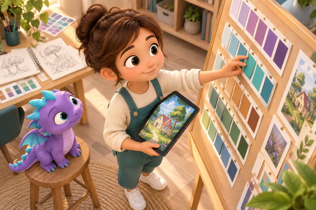
The color palette isn’t a final touch, but a decision that must be made early on. If the palette is defined before storyboarding, artists and animators work within a unified system. If the palette is determined at the post-production stage, it layers over already finished scenes and often doesn’t work—because the composition, lighting, and movement were done without color decisions in mind.
In a working pipeline, the palette is defined at the concept stage, locked in a style guide, and used as a reference at all stages. Deviations from the palette are possible, but they must be conscious, not random. This doesn’t limit creative freedom—on the contrary, it provides a framework within which variations work meaningfully.
FAQ
Do you need different palettes for horizontal and vertical versions of the same episode?
Not necessarily different, but adapted. The base palette can remain the same, but the distribution of accents and contrast needs to be revisited for the vertical format. Copying without adaptation usually doesn’t work.
How many colors should be in a series palette?
A base palette of 5–7 key colors is a solid guideline. This is enough for recognizability and variety. Accent colors can be used within individual scenes, but the overall system should remain stable.
How do you test a palette without professional equipment?
The minimum setup is three phones with different screen qualities. Watch the key scenes on each under different lighting. If critical elements are visible on all three, the palette is stable enough.
What should you do if the palette looks good on a monitor but bad on a phone?
Check the contrast between the character and the background—it’s likely insufficient for a small screen. Increase the difference in lightness or saturation. Also, check if too many colors are competing for attention in a single frame.
How do you coordinate the palette with the editing pace?
Define the palette before editing begins and discuss with the editor which scenes will be key. Use saturated colors in moments where the pace slows down and the viewer should linger. Use muted colors in fast transitions.