A vertical screen is not a horizontal frame turned sideways. When a viewer watches an animation on their phone, holding it with one hand, everything changes: composition, pacing, camera movement, even how a character enters the frame. Most studios approach the vertical format as a technical task—cropping finished horizontal content, re-editing, adding close-ups. But the viewer feels the difference between content made for vertical and content forced into it.
Over the past two years, we have worked with vertical animated series for mobile platforms in several regions. Every time, the first question from a new team is the same: “Can we just adapt what we already have?” The answer is no, if you want the viewer to watch to the end. The vertical format requires its own visual language, and it starts with the storyboard.
What Changes When You Switch Frame Orientation
A horizontal frame—16:9 or 21:9—gives you width. Characters can move left to right, the scene can fit multiple objects, and space works with depth. A vertical frame—9:16—takes away width and gives height. This is a fundamental change, not a cosmetic one.
In a vertical frame, horizontal movement looks unnatural. A character walking from left to right quickly leaves the attention zone because the usable frame width is a third of what it was in the horizontal version. But vertical movement—rising, falling, looking up—gains a dramatic power absent in the horizontal format.
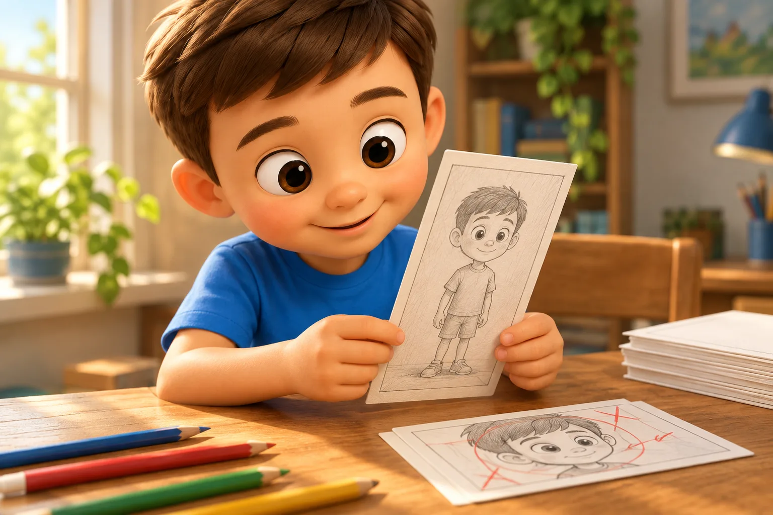
This means the entire storyboard needs to be rebuilt. A scene where two characters talk while standing side-by-side works naturally in a horizontal format. In a vertical one, their faces become too small, and the space between them loses meaning. The solution is a frontal composition, where characters face the camera, or sequential shots: one character, then the other.
Composition: Three Attention Zones
In a vertical frame, there are three zones that the viewer perceives at different speeds. The top third is first. The gaze lands here when the video loads. The middle third is the main retention zone. The bottom third is the action zone, where movement and gestures are read best.
In practice, this means that key information—a character’s face, emotion, object—should be placed in the top or middle third. The bottom third works for action: hands, movement, reaction. If you put an important detail in the bottom third and give it no movement, the viewer will miss it.
When storyboarding, we map each scene according to these zones. This isn’t a strict rule—there are exceptions where intentionally shifting focus downward creates tension. But the team must understand where the viewer’s attention is at every moment and make conscious decisions.
Close-ups Work Differently
In horizontal animation, a close-up is a tool for intimacy. The character’s face fills the frame, and the viewer sees the emotion. In a vertical format, the close-up becomes the primary language, not the exception.
The reason is simple: on a phone screen 6–7 centimeters wide, anything that isn’t a close-up loses detail. A medium shot, showing the character from the waist up, no longer conveys facial expressions. A wide shot, showing the entire figure, turns into a silhouette—useful for composition, but not for emotion.
Therefore, in a vertical storyboard, we often use a sequence: a wide shot for context (one to two seconds), then a medium shot for transition, then a close-up for emotion. The pace accelerates because each shot carries one function, not several.
Editing Pace and Information Density
Vertical content for mobile platforms is usually short—60–120 seconds per episode. This isn’t because the viewer lacks time, but because attention density on a small screen is higher but drops faster. The viewer doesn’t tire from rapid shot changes—they tire from pauses and empty spaces.
In a horizontal series, a 22-minute episode can afford a long scene without movement—atmosphere, silence, a slow camera push-in. In a vertical format, such a scene kills retention. Every 3–4 seconds, a visual shift is needed: a change of shot, movement within the frame, the appearance of a new element.
This doesn’t mean chaotic editing. The shift can be minimal—the character turns their head, the lighting changes, text appears. The main thing is not to let the frame freeze. When storyboarding, we mark tempo points: moments where a visual change occurs. If a scene goes more than four seconds without a tempo point, it’s a reason to rethink it.
Camera Movement in a Vertical Frame
A camera in animation is not a physical limitation, but a director’s choice. In a vertical format, the choice narrows, but some techniques become more powerful.
A vertical pan—moving the camera up or down—is rarely used in a horizontal format because it loses horizontal context. In a vertical one, it’s a natural movement: the camera rises from the character’s feet to their face, creating a reveal. This works especially well for introducing a character in the first episode.
A zoom is more effective in a vertical format than in a horizontal one because the frame is initially narrow. A quick push-in on a face creates a sense of invading personal space—useful for moments of shock or revelation. A slow pull-out gives a sense of isolation.
Horizontal panning—moving left or right—must be used carefully in a vertical format. Due to the frame’s narrowness, fast horizontal movement creates a “running past” effect that disorients. If you need to show a character moving, it’s better to use a sequence of shots with a fixed camera than a continuous pan.
On-Screen Text and Graphics
The vertical format often implies viewing without sound—on public transport, at work, in public places. This means on-screen text becomes part of the storytelling, not just an auxiliary element.
When storyboarding, we plan in advance where text will appear—a line of dialogue, a character’s thought, an onomatopoeia. The text should fall into the top or middle third, be large enough, and not overlap with the key action. If text and action compete for the same zone, the viewer chooses one and skips the other.
In animated series for Asian markets, on-screen text is the norm, not the exception. Viewers are used to reading parallel to watching. In Latin American and European markets, on-screen text is perceived as an advertising technique and should be used more sparingly. This decision is made at the storyboard stage, not the localization stage.
Silhouette and Character Readability
On a small screen, a character’s silhouette is more important than in any other format. If the viewer can’t recognize the character by their silhouette in half a second, they lose the thread of the scene.
This means character design must account for vertical composition right from the concept stage. A tall, slender character with long limbs reads better in a vertical frame than a wide, stocky one. Accessories—a hat, a cloak, a tail—must be visible in a narrow frame and not get lost when cropped.
Color also works differently. On a small screen, contrast is more important than palette. Two characters of similar shades blend into one mass. We need to separate them not only by color, but also by silhouette and position in the frame.
Storyboarding for Ads vs. Episodes—Similarities and Differences
If you are making both an animated series and promotional ads for it, the storyboards are built on similar principles, but with different densities. A 15-second ad creative requires an even more aggressive pace—a visual shift every 1.5–2 seconds, emotion from the first frame, conflict by the third second.
A series storyboard can afford more breathing room—3–4 seconds per scene, slow reveals. But the basic principles are the same: vertical composition, close-ups as the primary language, tempo points, readable silhouettes.
Teams that do both get an advantage: ad creatives made by the same hands as the series look organic and don’t give the viewer a sense of disconnect.
A Practical Approach to Storyboarding a Vertical Episode
When we start a new vertical project, the first step isn’t drawing, it’s structure. We break the episode down into semantic blocks and define for each: what shot, what attention zone, what pace. Only then does the storyboarding begin.
This seems like an extra step, but in practice, it saves days. A team that starts drawing immediately usually falls into a trap—the shots look good individually, but don’t add up to a rhythm. A structural pass forces you to think about pacing before time is invested in drawing.
Checklist: Storyboarding for a Vertical Episode
- Each scene is tied to one of three attention zones—top, middle, or bottom
- No scene lasts longer than 4 seconds without a visual shift
- Close-ups make up at least 40% of all shots in the episode
- Camera movement is predominantly vertical—zoom, tilt up, tilt down
- Every character’s silhouette is recognizable in a 7-centimeter wide frame
- On-screen text is placed in the top or middle third and doesn’t overlap the action
- The first frame of the episode contains a character’s face or silhouette, not a landscape
Common Repeating Mistakes
The most frequent mistake is using a horizontal storyboard and “slicing” it for vertical. The team takes a finished scene, selects the central fragment, and considers the task done. The result: characters are cropped at the edges, composition loses balance, and pacing falls apart.
The second mistake is overload. The team understands that the vertical format requires dynamics and stuffs the frame with details. On a small screen, this creates noise, not richness. It’s better to have fewer elements, but larger and clearer.
The third is ignoring the bottom third. Many storyboarders concentrate all the action in the center of the frame because they are used to horizontal composition. The bottom third remains empty, and the frame looks unbalanced.
What a Team Gains by Rebuilding the Language
When a team rebuilds the storyboard for a vertical format from scratch, the result is visible in metrics. Retention on the first episode grows by 15–25%. Completion rate increases. Conversion to the next episode does too.
This isn’t magic. The viewer simply gets content made for the screen they hold in their hand. They don’t feel that something is cropped or doesn’t fit. They feel that the story speaks their language.
The vertical format is not a limitation. It’s a different set of tools, and when a team masters it, horizontal and vertical projects start living in parallel, each with its own visual language.
FAQ
Can you use one storyboard for both horizontal and vertical versions?
No, if you want a quality result. Horizontal and vertical storyboards are built on different principles of composition and pacing. Only the scene structure—who, where, and what they do—can be shared. The visual solution must be developed separately for each format.
How many panels are in the storyboard for a 90-second vertical episode?
Usually 25–35 panels, depending on the pace. Fast episodes with frequent shot changes are closer to 35. Episodes with long scenes and minimal editing are 20–25. What matters isn’t the number of panels, but the presence of a tempo point every 3–4 seconds.
Should you draw the storyboard vertically, or can you do it horizontally and rotate later?
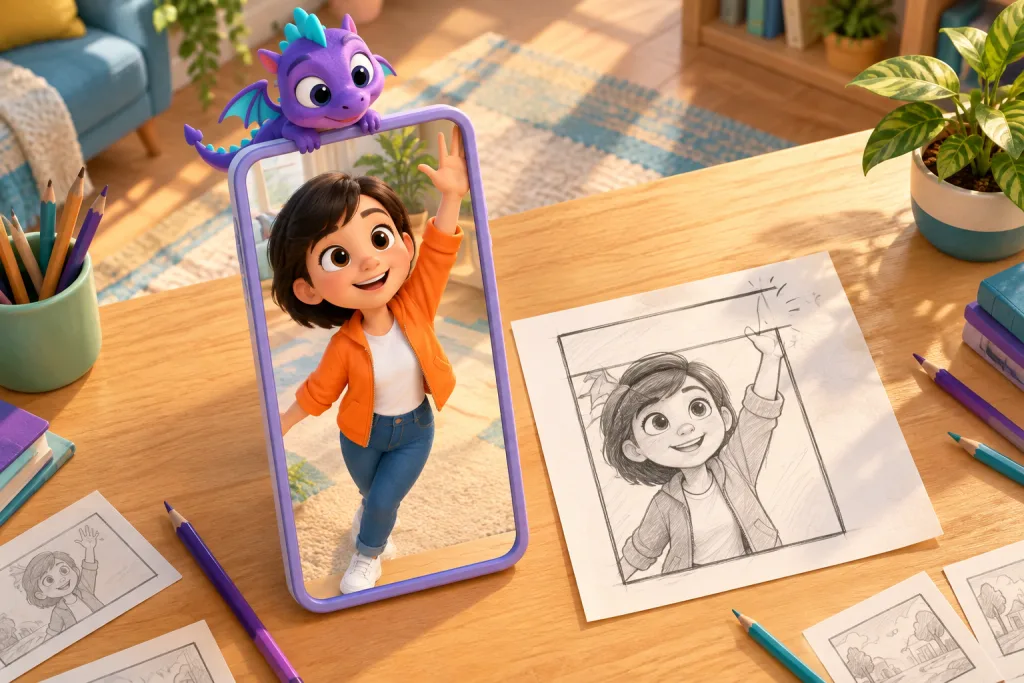
You should draw it vertically, in the orientation the viewer will watch it in. This forces the storyboarder to think within the real frame and make composition decisions that cannot be imitated by rotating a piece of paper.
How do you check if a character’s silhouette reads on a small screen?
Shrink the storyboard down to the size of a phone screen—about 6–7 centimeters diagonally. If the character is recognizable at this scale, the silhouette works. If it turns into a blob, you need to simplify the shape and increase the contrast.
Is storyboarding for vertical ads different from series?
The principles are the same, but the density is higher. In a 15-second ad, a visual shift is needed every 1.5–2 seconds, and emotion from the first frame. In a series, you can afford a slower reveal, but the basic rules of composition and attention zones remain.