
On a phone screen, a character lives in a space roughly five centimeters wide. The viewer watches it on the subway, in line, or between tasks. In the first three seconds, they need to understand who is in front of them, what this character is feeling, and why they should keep watching. If the silhouette is indistinguishable, the emotions are unreadable, and the color palette blends with the background—the episode gets swiped away, no matter how strong the story is.
In short mobile animation, character design isn’t an artistic indulgence; it’s a production decision. It affects the series’ recognizability, the speed of episode production, and how the character translates into merch, ad creatives, and localized versions. Over twelve years of working with animated content for international audiences, we’ve learned one thing: the most memorable characters aren’t the most complex—they’re the most readable.
Silhouette Matters More Than Detail
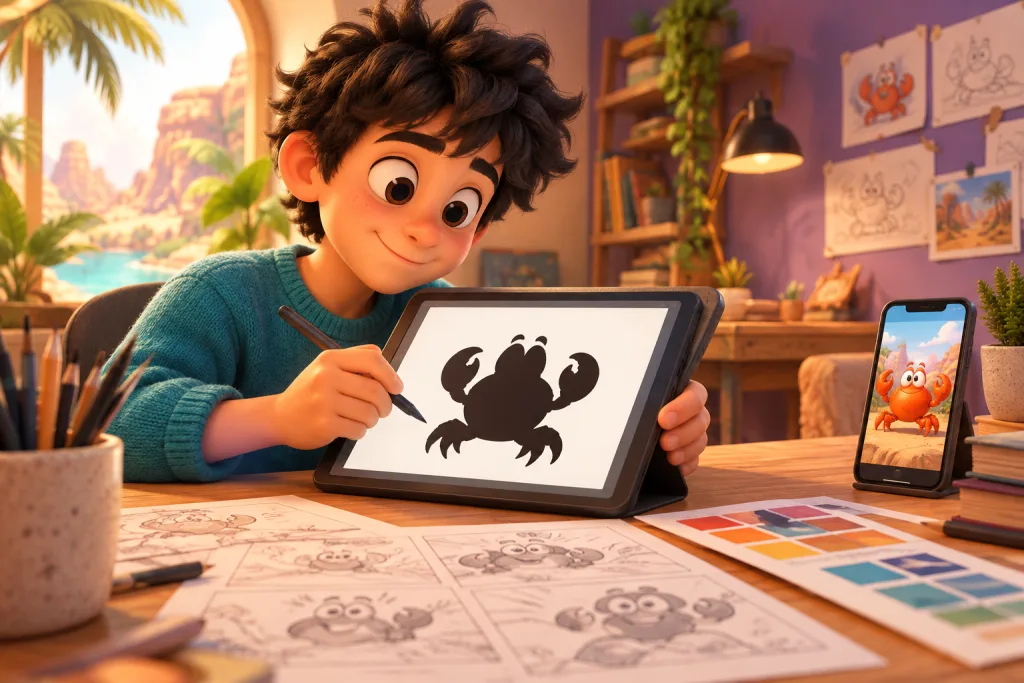
The first test we run with any new design is the silhouette check. The character is filled with solid black, with no lines or details. If the pose and personality can be recognized by the outline alone, the design works. If the silhouette turns into an indistinguishable blob, it needs simplification.
On a mobile screen, viewers often see the character at a scale where facial and clothing details are practically invisible. The silhouette becomes the primary communication channel. A character with a large head, pronounced shoulders, a signature hairstyle, or a noticeable accessory is readable even in a thumbnail. A character with realistic proportions and tiny details is not.
This doesn’t mean you should only draw caricatures. But you must understand: the smaller the screen, the more information the silhouette needs to carry. A good silhouette works like a logo—it can be recognized in a fraction of a second.
Color as an Attention Anchor
On a small screen, a character’s color palette must solve two problems: separating them from the background and cementing recognizability. We aim to give every main character one dominant color associated exclusively with them. If the viewer sees this color in the frame—even peripherally—they instantly identify the character.
The second principle is contrast with the background. If a series takes place in a forest, a character in green and brown tones will get lost. This seems obvious, but in practice, teams often get carried away with atmospheric palettes and forget that on a phone screen, the difference between the character and the background might only be a few shades.
The third point is limiting the number of colors. Three to four key colors per character is enough. Any more, and the viewer’s brain can’t process the information during a short scene. Any less, and the character looks flat and unexpressive.
Emotions Visible at Arm’s Length
In a short 60–120 second episode, a character doesn’t have time for subtle psychological play. The emotion must be read instantly. This means facial expressions work differently than in longer animation.
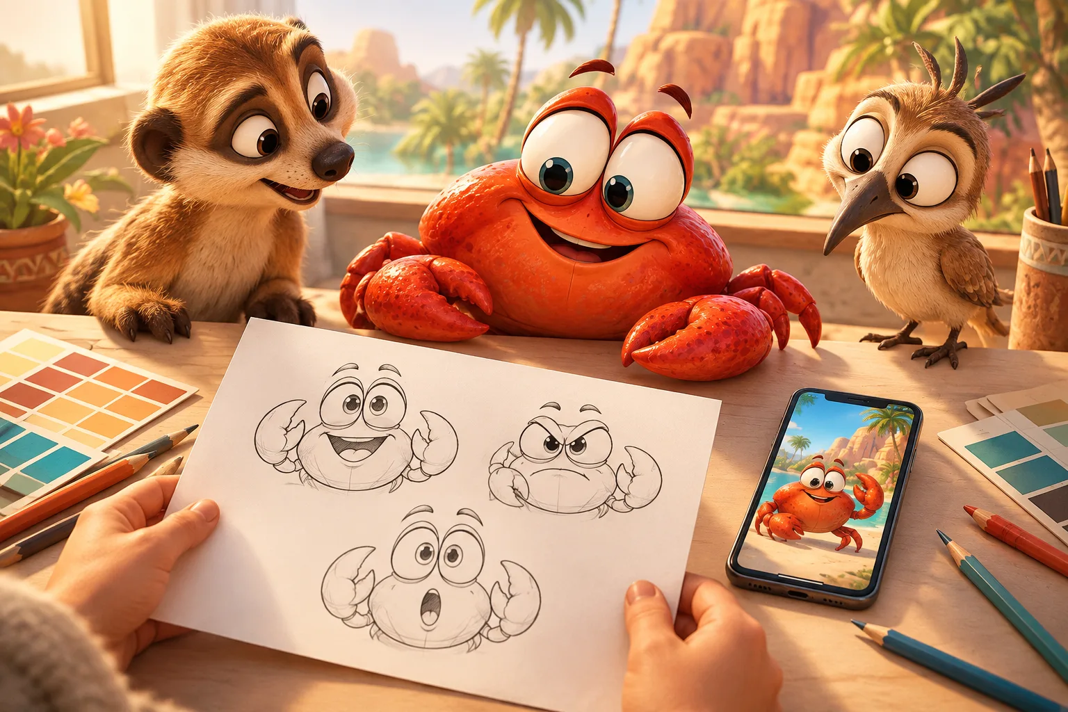
We increase the amplitude of eyebrow, mouth, and eye movements by about 30–40% compared to what looks natural in full-scale animation. On a large screen, this might seem exaggerated. On a phone screen, it’s exactly right. Eyes are the main tool. We make them larger than realistic proportions, and we ensure the pupil and iris are clearly visible even under bright lighting.
Another practical technique is relying on body posture, not just the face. If a character is upset, we don’t just draw sad eyes—we drop the shoulders, tilt the head, and clench the hands. The body conveys the emotion even when the face is too small for details.
Scale and Frame Composition
In mobile animation, we mostly work in a 9:16 vertical format or a 16:9 horizontal format that the viewer watches on a phone. In both cases, the character takes up most of the frame. This changes the approach to composition.
In feature-length or TV animation, you can afford wide shots where the character is a small figure surrounded by the environment. In short mobile animation, such shots work poorly. The viewer can’t see details and loses interest. We try to keep the character in a medium or close-up shot for most of the episode. We use wide shots sparingly—to establish the scene or for emotional emphasis.
If there are two characters in the frame, we position them so each takes up at least a third of the screen. Tiny figures in the corner of the frame almost guarantee the viewer won’t notice the second character’s reaction.
Repetition as a Production Strategy
A memorable character isn’t just about design; it’s about repetition. In short series with regular releases, viewers strengthen their bond with the character through recognizable elements that repeat from episode to episode. A signature pose, a trademark facial expression, a characteristic gesture, a recurring reaction to a specific situation—all these act as anchors.
From a production standpoint, repetition also means speed. If a character has a set of established poses and expressions, animators work faster. They don’t need to invent new facial expressions for a standard emotion every time. The library of poses and expressions we create during visual development pays off by the fifth or sixth episode.
This is especially crucial for series releasing two to three episodes a week. Without a standardized library, the team quickly descends into a production collapse.
Aligning Design with Format and Platform
Character design can’t be considered separately from the format and platform where it will live. A character for a TikTok series and a character for a streaming service are different tasks, even if the story is the same.
For vertical short episodes, we make characters more horizontally compact so they fit into a narrow frame without cropping. For horizontal episodes watched on a phone in landscape mode, you can use wider poses and horizontal movement.
For platforms with microtransactions, where viewers pay to unlock the next episode, the character must evoke a desire to “see what happens next.” This means the design must carry the promise of development—a hint of personality, a hidden backstory, the potential for change. A flat, flawlessly positive character performs worse in this format than one with a visible internal conflict.
Readability in Localized Versions
When a series goes to multiple markets, the character design undergoes a cultural readability check. Gestures, colors, accessories, proportions—all of these can carry different meanings in different cultures. We check key poses and expressions with local teams before production starts, not after.
This doesn’t mean you should make an averaged, safe-for-all-markets design. Often, highly distinct, unique characters perform better—they stand out. But you need to understand which elements might be misinterpreted and make a conscious decision: keep, amplify, or adapt them.
For example, a wide open-mouthed smile is read as joy in some cultures and as aggression in others. A clothing color associated with youth and energy in one market might be perceived as mourning in another. It’s easier to account for these things at the design stage than to redo them after localization.
The Most Common Mistakes We See
The first and most frequent is excessive detailing. The team draws a character with dozens of tiny elements: buckles, patterns, textures, layered clothing. On a large monitor, it looks beautiful. On a phone screen, it all blends into noise. We recommend testing the design on a screen the size of a video thumbnail—if the character is recognizable, the detailing is sufficient.
The second mistake is weak contrast between the character and the environment. Especially in scenes with atmospheric lighting: sunset, fog, night scenes. The team achieves a beautiful picture, but the character gets lost. The solution is to purposefully boost contrast during compositing, even if it breaks realistic lighting.
The third is using the same emotional amplitude for all scenes. If a character is equally expressive in a calm scene and the climax, the viewer feels no buildup. We plan the episode’s emotional dynamics in advance and save the expressiveness for key moments.
Checklist: Character Design Testing for Mobile Screens
- Silhouette is recognizable without lines or details—fill the character with black and check the outline
- One dominant color associated exclusively with this character
- Contrast with the background is checked on the target device, not just a monitor
- Emotions are readable at thumbnail scale—increase facial expression amplitude by 30–40%
- Character takes up at least a third of the frame in most scenes
- A library of 8–12 reusable poses and expressions is created for serial production
- Design is checked with local teams for cultural readability before production begins
Designing a character for mobile animation isn’t about talent or taste. It’s about discipline: silhouette, color, scale, readability, repetition. Each of these parameters can be tested and improved before an episode goes into production. And it’s these checks that separate a character the viewer will remember and return to watch, from one they’ll swipe past in three seconds.
FAQ
Do you need to make different characters for vertical and horizontal formats?
Not necessarily, but the design needs adapting. For vertical formats, we make poses more horizontally compact and ensure the character isn’t cropped by the frame edges. The core design can stay the same.
How many colors are optimal for a single character?
Three to four key colors are enough for recognizability and expressiveness. More, and the viewer can’t process the information in a short scene. Less, and the character looks flat.
How do you check if a character is readable on a small screen?
Shrink the image to the size of a video thumbnail on a phone. If the silhouette, color, and emotion remain recognizable—the design works. If it turns into a blob—it needs simplifying.
Why do you need a pose library if you have animation software?
A pose library speeds up serial production and ensures visual consistency. The team doesn’t waste time inventing facial expressions for every standard emotion, and the viewer strengthens character recognition through repeating elements.
When should you check a design for cultural readability?
Before production starts. If you plan to localize for multiple markets, check key poses and expressions with local teams during visual development. Redesigning after episodes are produced is significantly more expensive.