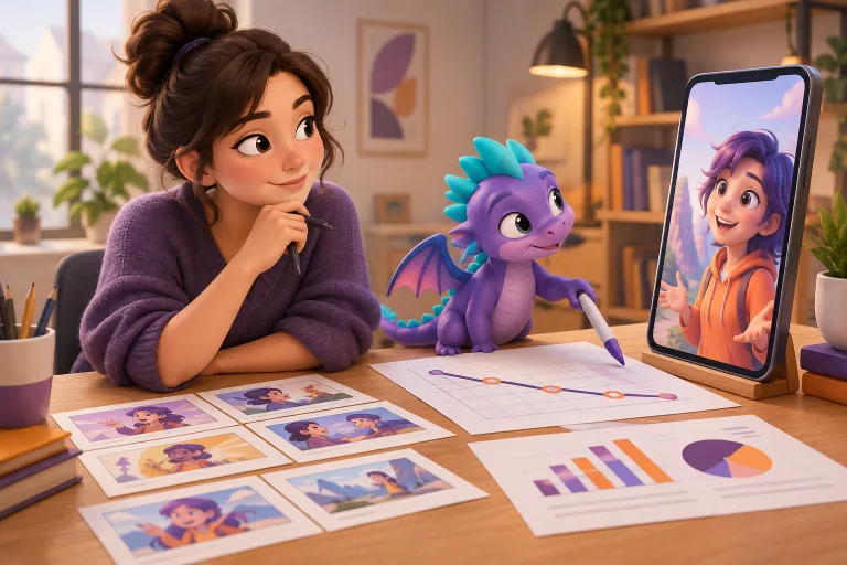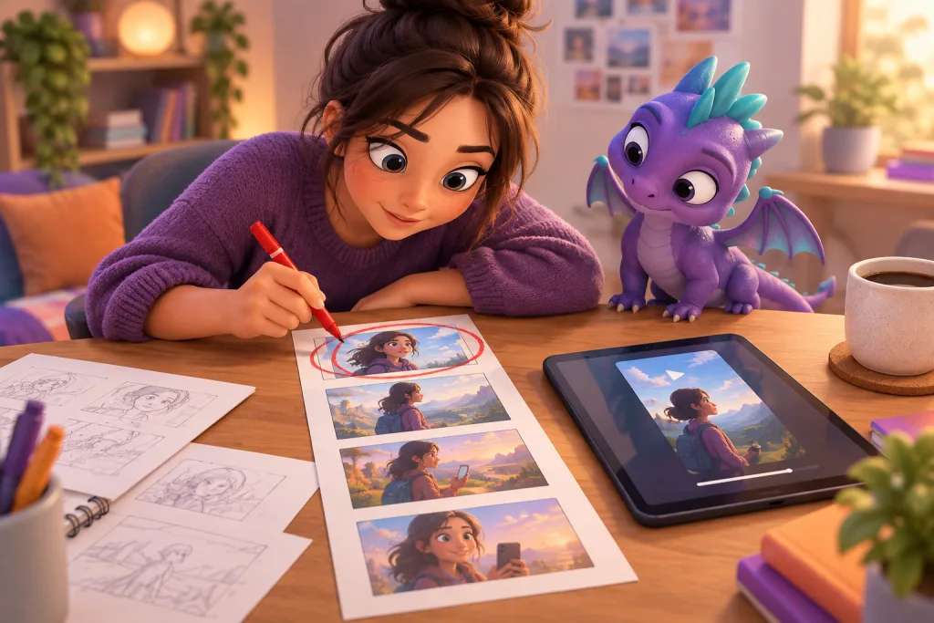
Three seconds is not an intro, it’s the entire contract with the viewer
When a viewer sees your creative in the feed, you have about three seconds to give them a reason not to swipe. This is not a metaphor or an exaggeration: in mobile advertising, the share of full views is distributed in such a way that the lion’s share of drop-offs happens in the very first moments. If the creative doesn’t hook them at the beginning, no strong ending will save it—they simply won’t reach it.
This means that the first three seconds should be treated as an independent production block. Not as an “introduction”, not as a “warm-up”, but as a separate mini-creative inside the big one, with its own task, its own structure, and its own metrics. Teams working with large volumes of creatives for user acquisition know: the difference between a creative that retains 40% of viewers and one that retains 15% almost always lies in the very first frames.
In this article, we’ll break down what exactly makes the first seconds work, what mistakes are most common, and how to structure production to improve this segment systematically rather than guessing.
What the first seconds actually measure
The metric most often looked at when starting a campaign is retention by second, i.e., the percentage of viewers remaining at the 3rd, 5th, and 15th seconds. In mobile networks, the 15-second view rate is especially important because many platforms count a view and send a conversion signal only after this threshold. But you won’t get 15 seconds without the first three.
It’s useful to divide drop-offs into three types:
- Instant drop-off (0–1 sec) — the viewer didn’t even understand what was being shown. Often associated with unrecognizable visuals, a frame that’s too dark, or confusing motion.
- Recognition drop-off (1–3 sec) — the viewer understood the format but didn’t get a promise. This is the most common loss zone.
- Expectation drop-off (3–7 sec) — the viewer was interested, but the pace slowed down, and their attention drifted.
Each zone requires different production solutions. You can’t just “make the beginning brighter”—you need to understand in which zone the creative is losing people.
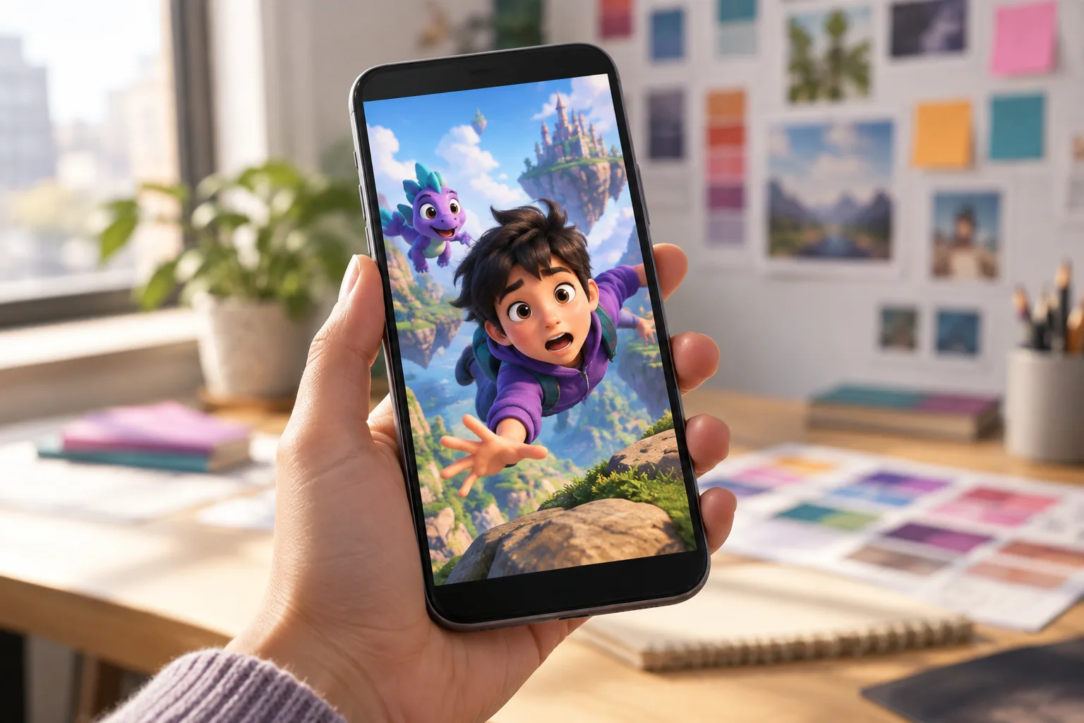
Four working techniques for the first frames
Over years of producing and testing video creatives for mobile UA, we’ve identified a few techniques that consistently improve retention in the first seconds. These aren’t rules—they’re patterns that work more often than others.
1. Recognizable action in the first frame
The viewer must understand what is happening in the very first second. Not “will understand in a second,” but right in the first frame. If it’s a game, show gameplay. If it’s an animated series, show a character in a typical situation. If it’s a product, show what you do with it. Abstract intros, logos, and “atmospheric” shots almost always lose to direct action in mobile advertising.
2. Contrast within the scene, not between scenes
Many creatives are built on sharp cuts: an explosion, a change of location, a flash. This works, but only if the contrast is already present within the first frame. The viewer scans the frame in a fraction of a second—if there is visual tension in it (contrast of light, color, scale, direction of movement), they linger. If the frame is flat and symmetrical, the swipe happens faster.
3. Voice or sound before text
In mobile networks, sound is often turned off, but when it’s on, voice works faster than text. A voiced first phrase sounding in the first one and a half seconds creates a feeling that the creative is “talking to you.” Subtitles at the beginning work worse because the viewer hasn’t yet decided whether it’s worth reading.
4. A promise, not a question
A common technique is to start with a question: “What if…?”, “Did you know…?”. In theory, this creates curiosity. In practice, in a mobile feed, a question is often perceived as a pause. A direct promise works better: show the result, show the conflict, show the transformation. The viewer should see what they will be offered, not hear a riddle.
Four mistakes that kill retention
Too long scene setup
The creative starts with a wide shot, then the camera zooms in, then a character appears, then they do something. By the time the action starts, the viewer is already gone. In mobile advertising, the first frame must already contain action or its immediate threat.
Logo or branding in the first frame
A brand in the first seconds is almost always a minus for retention, unless the brand itself is a magnet. The viewer perceives the logo as an advertising signal and swipes faster. The brand is appropriate later, when the viewer is already engaged.
Text that takes longer than a second to read
If a block of text appears in the first frames, the viewer either reads it and misses the action, or doesn’t read it and leaves. Text at the beginning should be short, large, and supporting the visual, not replacing it.
The same pace throughout the entire creative
If the first three seconds go at the same pace as the middle, the viewer doesn’t get the signal that “something important is happening here.” The pace at the beginning should be denser: faster cuts, shorter pauses, more active movement. This doesn’t mean “flickering”—it means giving a sense of energy.
How to produce the first seconds systematically
The main mistake teams make is treating the first seconds as a creative decision that an editor or director makes by instinct. At a volume of dozens and hundreds of creatives a month, instinct doesn’t scale. You need structure.
A separate storyboard block for the beginning
In the storyboard, the first three seconds should be a separate block with its own task. Not “the beginning of the episode,” but “the hook.” It’s useful to storyboard this block in two or three variants to test later. If a team makes 10 creatives for a campaign, the first seconds of each should differ in approach—not in visuals, but in the type of hook: action, conflict, promise, character.
A checklist for every creative
Before launching a creative, it’s useful to run it through a short checklist: what does the viewer see in the first frame, what do they understand by the end of the first second, what do they feel by the third second. If there is no clear answer to any of these questions, the beginning needs to be reworked.
Testing variations of the beginning, not entire creatives
One of the most effective ways to improve the first seconds is to test different beginnings of the same creative. If you have a working middle with acceptable conversion, make three variants of the first three seconds and launch them in parallel. This is cheaper than making three different creatives and gives a clean signal: which beginning works better.
How first-second data affects the next production
When a campaign has gathered enough impressions, retention curves provide information that cannot be obtained any other way. You see exactly where the viewer leaves and can compare the beginnings of different creatives against each other.
This should feed back into production. If creatives with “action in the first frame” retain 20% better than creatives with an “atmospheric intro,” this is not an observation—it’s a production rule for the next batch. Teams working with large volumes of creatives know: the best directorial decisions for the first seconds come not from inspiration, but from analyzing what has already worked.
It’s useful to keep a simple internal database: hook type, visual pattern, pace, retention result. After a few months, this database becomes more valuable than any external benchmark because it’s built on your creatives, your audiences, and your products.
What makes the first seconds “yours”
One of the pitfalls of working with the first seconds is the temptation to copy what works for others. In mobile advertising, this is especially easy because formats and techniques are highly visible. But copying someone else’s hook rarely yields the same result because a hook only works in tandem with the product, audience, and context.
The best approach is to find 2–3 types of beginnings that work specifically for your content and develop them. If you have an animated series, a working hook might be a character’s emotion. If you have a product, an action with the product. If you have a game, a moment of gameplay tension. These are not universal rules, but directions that need to be tested on your own data.
Checklist: the first three seconds of a creative
- In the first frame, the viewer sees action, not a logo or intro
- By the end of the first second, it’s clear what the creative is about
- Sound or voice appears in the first one and a half seconds
- The pace at the beginning is denser than in the middle
- The text is short and supports the visual rather than replacing it
- At least two variations of the beginning are made for testing
- After launch, we record the hook type and retention result
Practical takeaways
The first three seconds are not a “beautiful beginning,” but a working conversion tool. Teams that treat them as a separate production block gain two advantages: better retention at the start and faster accumulation of knowledge about what works. In mobile advertising, where creatives live shorter and shorter lives and production volume grows, systematic work with the first seconds is not a nuance, but a basic skill.
If your team makes creatives for user acquisition and doesn’t analyze retention by the second, you are losing the cheapest way to improve results. You don’t need to make more creatives—you need to make the first three seconds of the ones you already have better.
FAQ
Do you need to make different first seconds for different platforms?
Yes. On platforms with autoplay, a visual hook in the first frame is more important; on platforms with tap-to-play, a promise in the preview is. But the basic principle is the same: the viewer must get a reason to watch in the first seconds.
How many variations of the beginning should be tested simultaneously?
For one creative, 2–3 variations of the beginning are enough. More—if you have a large volume of traffic and can get a statistically significant result in a short time.
What to do if a creative holds well for the first three seconds but loses viewers at the 7–10 second mark?
This means the beginning works, but the middle doesn’t. Don’t change the first seconds; analyze the pace and content of the second third. Often the problem is that after a strong start, the creative “runs out of steam” and moves on to a slow explanation.
Is it worth using a logo in the first three seconds if the brand is recognizable?
Even for recognizable brands, a logo in the first frame most often reduces retention. It’s better to show the brand after the viewer is already engaged—for example, at the 3–5 second mark.
How to measure the quality of the first seconds if there is no access to retention by the second?
Use the 15-second view rate as a proxy. If it’s low with a good volume of impressions, the problem is almost certainly in the first seconds. It’s also useful to look at the CTR for the first impressions—it indirectly reflects how well the beginning attracts attention.